
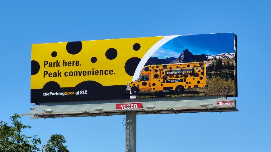
6 Easy Ways to Waste Money on Your Next Billboard (And How to Fix Them)
A car drives past a billboard packed with three full sentences, a fancy script font, two website links, and a tiny logo hidden in the corner. How much of that message actually gets read?
Almost none of it.
Whether traffic is stopped at a red light or moving down the highway, outdoor ads operate on borrowed time. Most drivers offer about 8 seconds of attention before refocusing on the road ahead. That means a billboard cannot function like a website, print ad, or flyer. Squeezing in too much detail usually results in no message landing at all.
Before launching an outdoor advertising campaign, keep these six common design mistakes in mind to protect the budget and maximize impact.
1. Putting Too Many Words on the Board
It’s tempting to squeeze in as much information as possible when paying for ad space. But drivers don’t have time for taglines, bullet points, or full sentences.
- The Fix: Stick to 7 words or fewer. Keep it short, direct, and easy to read. If a word isn’t essential, cut it.
2. Picking Fonts That Look Great on Desktop, Bad on the Road
Thin lettering, cursive, and decorative fonts might look nice on a graphic designer’s monitor, but they blur together from 100 feet away.
- The Fix: Go with bold, heavy, clean typefaces. Legibility wins over artistic style every single time.
3. Squeezing Your Logo into the Corner
A great visual or clever line is useless if people can’t tell who paid for it. If a logo is tiny or buried in the artwork, people drive off without remembering the brand name.
- The Fix: Make the logo clear and prominent. Pair it right alongside the main image or offer so viewer recognition is instant.
4. Trying to Pitch Three Things at Once
If a driver has to guess what is being sold, the ad fails. Trying to promote three different services or list multiple store locations on one board just creates visual clutter.
- The Fix: Pick one single message. Feature the best product, strongest offer, or main service—and stop there.
5. Using Weak Color Contrast
Text that blends into a busy background image disappears outdoors, especially in direct sunlight or bad weather.
- The Fix: Use high-contrast colors like stark white text on a dark background or dark bold lettering on a bright solid color. Contrast keeps the text readable in any lighting.
6. Skipping a Simple Next Step
Once a billboard captures attention, where does the viewer look next? Without a clear direction, valuable leads disappear.
- The Fix: Give them one simple action: Visit our site, Call today, or Take Exit 5. Keep it easy to remember when pulling over later.
Great billboard ads don’t tell a company’s whole backstory. They trigger curiosity and leave a clean impression in a single glance. Keep the layout clean, the text short, and the branding obvious.
Planning an outdoor campaign? Reach out to our team. We’ll help you design a billboard that gets noticed and brings customers through your door.