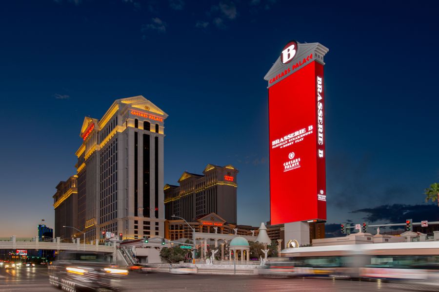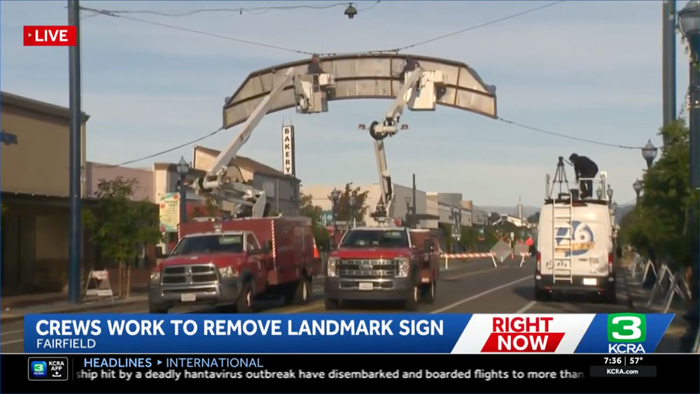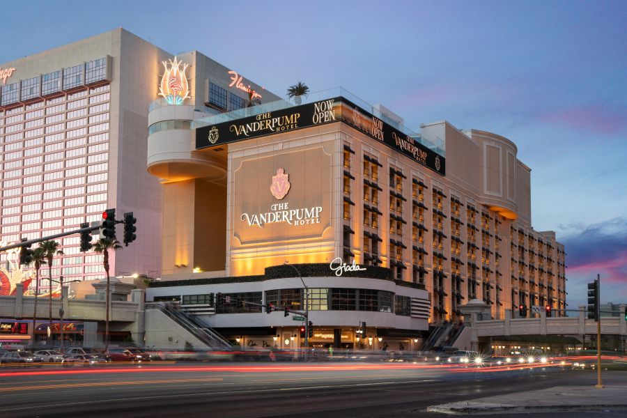
We Just Wrapped Up a Major Signage Transformation for the Vanderpump Hotel in Las Vegas
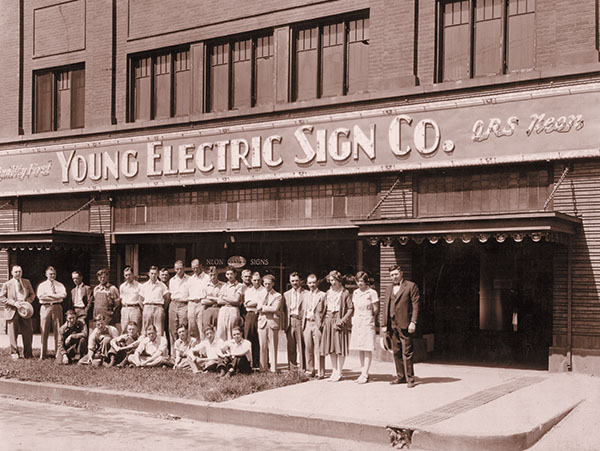
Our team recently finished a signage transformation for The Vanderpump Hotel, Lisa Vanderpump and Caesars Entertainment's new boutique property at the corner of Las Vegas Boulevard and Flamingo Road. We collaborated with Caesars Entertainment to handle the fabrication and installation. The project replaced the legacy components across the entire property with a highly integrated, modern...