Humans have an intuitive association with colors derived from nature and cultural meaning. Color palettes can immediately send signals that trigger a reaction It is this connection and response that you want to create with the power of color branding.
Importance of Color in Sign Design
Merchants and marketers have long on alluring color schemes to create mood, draw attention, and communicate without words. The color wheel was invented in 1666 by Sir Isaac Newton. No doubt, industrious butchers, bakers, and candlestick makers (and ye olde sign designers), must have found it a valuable tool to add vibrant colors to the signs that hung outside their establishments.
An understanding of the effects a color has on your audience can help you convey the qualities you want to project for your business. It is a major factor in the first impression they have about your brand,.. According to research by the Institute for Color Research people make a subconscious judgment about a person, environment, or product within 90 seconds of initial viewing. Between 62% and 90% of that assessment is based on color alone.
Here are ways certain colors influence your customer.
- Blue – considered to imply authority, trust, security. Light blue is associated with water, peace and tranquility. Dark blue implies wisdom, expertise, and stability. Blue is the world’s favorite color with 57% of men and 35% of women ranking it as their top choice.
- Purple – signals wealth, sophistication, royalty and superiority. It can also engender feelings of decadence. Dark purple conveys mystery, medium purple creativity. Light purple produces feelings of sensitivity and harmony.
- Orange – this is the color of creativity, fun and motivation. Associated with the sun, it evokes warm feelings and optimism. Light orange implies spontaneity, medium orange success and freedom, and dark orange desire and action. The color has proven to be valuable when eliciting response in calls-to-action. Red – associated with energy, urgency, and power. Light red conveys love and passion, medium red creates feelings of action and fearlessness and dark red implies leadership, vigor, and excitement. Red is one of the most common colors used in branding, particularly in the food industry. The color has been shown to make people hungry.
- Green – brings feelings of nature and health, prosperity, hope,and freshness. Light green spreads messages of healing and emotional well-being, medium green growth and life and dark green prosperity.
- Yellow – represents happiness, optimism, and warmth. Light yellow signifies positivity, medium yellow energy, and bright yellow youthfulness. Yellow can also be associated with caution and warnings.
- Pink – associated with femininity, youthfulness and quirkiness. Light pink is seen as healing, medium pink joyful and bright pink conveys boldness. A unique aspect of pink is that its effect tends to lessen over time and even deliver the opposite reaction than desired.
- Black – used to add sophistication, power and elegance. Favored in the fashion and tech industries, black gives brand and signage refinement and an element of class. It’s also one of the most widely used colors because of its ability to make other colors appear brighter and more visible.
- White – the color of all colors evokes simplicity, cleanliness and innocence. White is effective when used in combination with every other color. It is an ideal choice to deploy as background, text or border and to make design elements stand out.
Psychology of Design
Only one color may work for automobiles and traffic signals, but when you use color to express your brand with signage, it’s the contrast between two or more that gets your message noticed by your audiences and recognized by customers. That is when an understanding of color psychology comes into play.
Color psychology is research about the impact of the different hues, tones and shades of color on mood, behavior and decision making. It takes into account the impact that personal experiences, gender and cultural messaging can play in causing different reactions from the same color. Color combinations can tell a story and applying color psychology lets you discover the arrangement of colors that align with your business’s goals and those of your target audience.
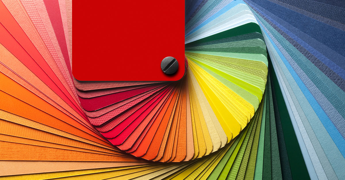
One dependable tool to test out color combinations is the earlier-mentioned color wheel. A color wheel contains red, yellow, orange (referred to as warm colors on the left side and blue, green, and purple (cool colors) on the right. Complementary color combinations are colors that sit on opposite sides of the color wheel and when used in tandem create a contrast for attention-grabbing and legible signs. Analogous color combinations are two to five colors that sit beside each other on the color wheel. Deployed together, these colors generally create a sense of balance, especially when one color is dominant and the others serve to accent it. Triadic color combinations are rich and vibrant color combinations and are created by drawing a triangle on the color wheel with each tip landing on the colors to combine together on your sign.
Applying color psychology in order to select the right colors for your signs can quickly impart your company’s philosophy and have a direct impact on your sales. According to slideshare.net, 84% of shoppers say the colors of a brand are the primary reason they buy a particular product.
Applying Color Psychology in Your Brand and Signage
Armed with the knowledge of the emotional impact of colors and bolstered by color psychology research, you are better prepared to design business signage that draws attention and delivers a message, even a subconscious one, that has an implicit meaning to your customers.
In most cases, it is through your exterior and indoor signs that your audience forms their first and lasting impression about your business. Keep in mind the two fundamental things your signs must address: attracting attention and communicating clearly. According to a University of Loyola, Maryland study, color increases brand recognition by up to 80%. Use the colors of your signage to send a clear message and stand apart from your competition.
Here are a few points to remember:
White is Your Friend
The importance of white space in signage cannot be overlooked for its ability to create a balanced contrast with every other color in your palate. Don’t crowd out white space with color congestion, ideally using no more than two others.
Color and Contrast Matter
Signs with high contrasts send messaging to the human brain quickest. Colors that work together make design elements stand out for a stunning and memorable look. Bold and bright colors work together well to create signs that capture the attention of audiences.
Test Your Color Combinations
Regardless of how in love you are with your signage and brand color combination, test it. Get trusted opinions from loyal customers. If it’s an outdoor sign, look at it in the environment to confirm visibility. It’s not unusual for the colors of a sign to appear differently on a screen than when printed or when lighting elements are activated/ Working with an experienced sign design company should help you avoid last minute surprises.
What Colors Work Best With Your Sign?
There really is not one answer as to what the best colors for your brand and signage are. Your instincts may tell you to select colors that are different from your competitors to set you apart, and you may be right. However, color psychology may also tell you there’s a reason your competitors have similar colors although in different shades and patterns. For outdoor signs, use bold, bright colors that are going to attract attention from a distance. With indoor signs, the colors you select need to be appealing and eye-catching. They must also be legible. It is advisable to border text with contrasting colors to distinguish it further from the background or add an outline to one of the colors to make it pop out.
The colors you select for your brand and signage can be the difference between creating an engaging experience for your customers or losing the first, and perhaps only, opportunity to begin building a powerful connection with them. Use color psychology and the characteristics of color in your signage to influence your audience’s perception of your brand. YESCO can show you how. Contact us today.